So this course, that is not a proper academic course in conventional terms, I taught for the passing semester was intended to be a ‘catch-up’ class for second year architecture students. I call it accidental since it was on request by the Rectorate over the last minute and I just happened to be the instructor, alongside my primary duties in 1st year. The content of the course covers some basic knowledge of digital tools of Autocad and Photoshop, and, more importantly, their integrated uses. With no structured curriculum, it was more of sharing tips and introducing some basics about graphic design, visual communication and related applications largely on the platforms of Adobe Softwares. Luckily, these were some of the issues I have been keen on during my undergrad studies, and somehow unofficially mastered by myself, where I gave couple of lectures on several studios . During this period, I was also able to reevaluate the role of graphics in architecture and communication, and through analyzing my own work, I was able to focus and contemplate about the critical use of graphic design in creating and structuring ideas. The latter subject was embodied at a given lecture at a Graphic Design Department in another institution back in 2008. (You will be reading about that visit, inside the blog). After these works and subsequent research in graphic design, during my recent master study, all this gave way to the significancy and intrinsic values of a drawing, the central and unique tool of architecture in its own right, distancing my aim away from an organized poster design.
So far, this course provided me a chance to revisit my knowledge and skills in short, and to relocate my aim around the paths between various sorts of visual communication, of architectural drawings, diagrams, abstractions, collages and board presentations. I will be displaying some of the ‘accidental’ keynotes and the ‘pop-up’ material which I kept limited for practical reasons, and some final student work seemed surprising given their low attendance and fluctuating attention. (The content will be displayed in two pieces as it would be too long for one post). Please note that the work is done in the final yet I literally did a complete class, not an exam. But I am fairly happy with the results, still.
-You may use my last comment to get an idea on the level of their attendance, the fact that I am taking advantage of the exam being a full class, and eventually the reason for the work evaluated as remarkably ‘surprising’. :)
(1) Elements of visual design and the practice of the ‘eye’.
For the onset, I tended to introduce what the visual design might be about, and to foster a quick rethinking session by showing how wide the graphic design is practiced and thus it exists as an essential field of design in everyday life. The material I’ve collected, composed of visual archives from my earlier Design Studio course at SKM-ITU and of pictures I personally took, comprised examples from a wide scope such as printed material, interface design (iOS Apps), physical spaces and applied integrated identities (BBC News, Citibank by Pentagram), package design and branding (EAT Company by Pentagram), industrial designs and objects (Halfords, The Ohmine Shuzo by Björn Kusoffsky), several renowned cities of visual image (Paris and New York) and some pure perfections of graphic design almost as an art form (to name, I’ve displayed the “Ten Principles Wall” of Dieter Rams by Bibliothèque London).

Corporate identity and packaging for Ohmine Shuzo Sake by Björn Kusoffsky, The fresh look of BBC News (see the studio above), Halfords Chemicals packaging design
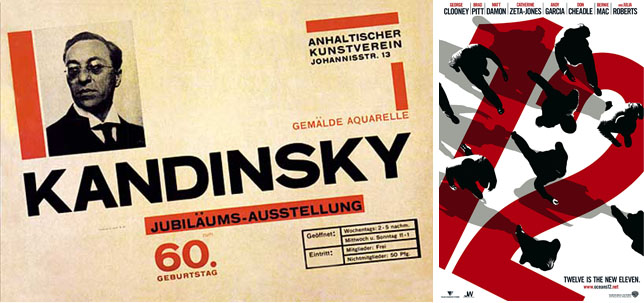
And for a closer look at the subject, for the first-hand assessment of graphic design’s basic elements, we went back to the masters: El Lissitzky and Herbert Bayer, alongside the works of early Czech designers and the mastery of Doesburg in De Stilj (which is a perfected microcosm for the essentials and the cogent inner dynamics of graphic design). While Lissitzky is widely known and very much considered as the ‘father’ for liberating the immaterial world of abstract elements of two-dimensional design, the interplay of those is thoroughly present in the work of Bayer. One is able to see the essential features of a composition, the key concepts of Contrast and Repetition, of Alignment and Informative Hierarchy in his work. (See the recurring use of shifted diagonal alignment in Ocean’s Twelve Movie Poster)

Cover design for zijeme by Ladislav Sutnar – 1931, ‘A perfected microcosm of the basic of simple yet cogent graphic design’: Cover for De Stilj Magazine by Van Doesburg – 1922
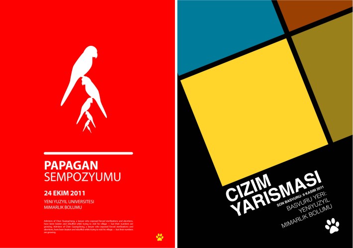
To exemplify the application of these few yet vital elements of visual composition, and to show how quick one can produce when the eye is electrified and utilized, I have made couple of poster designs with the live participation of the class.

Rapid-production poster designs (made in 4 minutes): Exemplifying the methods of Contrast, Repetition, Hierarchy and Alignment
Please see An accidental CAD Course: (or) Some Tips for Visual Communication in Architecture – 2 for the sections (2) The methods of visual abstraction and Constructing a Reality for a project: The Collage and The Unique Drawing & (3) The integrated presentation in Architecture: The Board as a complete visual design work.


